Alinea Invest
The investment app that makes it easy for Gen Z to invest in ideas they believe in.


Overview
What is Alinea?
Alinea is an investing app for GenZ that is interested in understanding the companies they are investing in. They tell you how each company makes money, treats stakeholders, and affects the world in an environmentally friendly way so that you can invest in companies you believe in. The team was tasked with redesigning this platform to fit the target audience.
The Problem
When Alinea’s beginner users try to learn more about the investment landscape they feel overloaded by financial jargon, concepts, and stock options. They feel hesitant on where to begin investing and getting started becomes overwhelming and intimidating. How might we help Alinea users become comfortable and familiar with investing and encourage them to invest long term?
The Solution
Clear steps to assist users in completing a profile and a way for them to verify the app's credibility before funding their account. A personalized search feature with recommendations based on users’ current investment profiles. Created a reward feature that promotes active investment and encourages long-term investment. With this product, users can learn about investing at any stage of their investing journey as well as start investing as a beginner.
Duration
May 2021 to June 2021 (3 weeks)
Team of 4
Adiba Khan
Christian Villalba
Kloe Qiao
Deborah Sung
My Role
UX Researcher, UX Designer,
UI Designer
Tools
Figma, Miro, Canva
Existing App
Empathize
Screener Survey
The first step to creating a great user experience will be identifying Alinea's target users and getting to know them better. What is the best method for finding the right candidates? A screener survey was developed to determine potential interviewees' age, gender, investment platform, any apps they use, and level of investing knowledge.
User Interviews
21 people participated in the Alinea screener survey and 14 interviews were conducted with current and potential Alinea app users:
Have little to no investing experience.
Gen Z and minorities (women, college students, and young professionals).
Research Findings
Users want to have access to and have an understanding of their portfolio status with ease — Ease of usability.
Users would love to have app features to help with investing and believe diversifying their investments is important — Assistance.
Trustworthiness is important for users to know the app is legit and willing to fund their money in for the long-term - Credibility.
Users equate personalization with recommendations catered to them through their activities - Personalized Recommendation.
Encouragement to continue using the app for the long-term - Reason to invest long-term.
Certain incentives to sign-up with an investment app and fund the account - Motivation.
Define
Persona Development
Based on the insights uncovered during the research phase, a persona can now be developed to help identifying users' needs, goals, and behaviors. Meet Soledad!
The Problem
Soledad knows the importance of investing and finally has disposable income to invest. However she feels burdened and discouraged as a beginner investor. She feels financially illiterate because she doesn’t know the best practices of investing.
How might we help Soledad become comfortable and familiar with investing and encourage her to invest long term?
Ideate
Developing the design opportunities
Based on Alinea's goals and the research, four areas of opportunity priorities in design strategy have now been evaluated and strategized to meet both business goals and user needs.
On-boarding - a step by step of “how to get started with investing on Alinea?”
Home Screen - to bring an urgency for a user to start investing.
Search Function- to be able to provide an instant discovery, so users can find what they are looking for and start investing.
Reward Program- to give users some kind of incentive and retain users.
Wireframes
Now that clear goals and a vision have been established, the ideation process can begin with a design studio and implement into mid-fidelity wireframes to explore potential solutions based on the findings from the research stage and integrate them into future functionality.
Iterations
The On-boarding
When asked to sign–up for an account, users tend to skip the account sign-up onboarding process to redeem the incentive and browse the app before completing the whole onboarding process. There wasn’t an option for users to be able to skip any step of the onboarding process, adding this option allows users to redeem their incentives and navigate through the app first.
Users were not encouraged to click on the "redeem now" call to action button because it was not visible. A call to action overlay indicating the "redeem now" action has helped users see the value of clicking.
The Home Screen
On the home screen onboarding, users did not know where to click to continue. By introducing a "call to action" button instead of predicting users will click anywhere to continue, the process is smoother.
Users do not understand what information the pie chart provides, and wish to be able to see their current investment standing. Adding a button to another graph view to provide users with their investment status.
The Search Function
Users mentioned they would like to see more personalized recommendations as well as what are the trending stocks in the market, so sections such as "Recommended for You", "Trending", and "New to Market" has been added to provide recommendations that are tailored to the user's interests and profile.
When asked to “browse stock in the tech industry”, users were confused by the title cards and thought they are clickable. Relocate the title out of the card and activate the swipe-through of each recommendation category to avoid confusion and increase intuition.
The Reward Program
Users appreciated the fun graphics that acknowledged their milestones on the app and found it easy to find and check their rewards. The rewards page provided an incentive to continue investing and funding their accounts. However, users were hesitant about clicking on the "trophy" icon for rewards but eventually followed through. The bottom navigation bar is now labeled to confirm that all icons correspond to its functions.
Deliver
Style Guide
Color
Continuing with the unique "Alinea purple", the color of the brand our client is currently promoting, we added a purple with a hint of blue tone to the color palette to add some more character.
Typeface
Based on the research, Lato was chosen as the typeface to combine the feeling of modernity with ease of reading. As for the color, the color navy was chosen instead of black to enhance its friendliness as the app is aimed at beginners.
Hi-Fidelity Usability Testing
Metrics for measuring success
A second round of testing was conducted after we refined our solution based on the feedback and recommendations we received during mid-fidelity testing.
As a result of the changes we made, our solution improved all around.
Final Design
The Onboarding
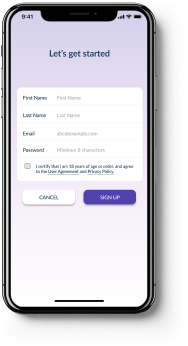
Step-by-step sign-up onboarding involves users in each step and aims to establish a trustworthy interaction experience so they feel confident funding their accounts. To create a better interactive experience, infographics were added to provide a clear yet engaging onboarding experience.
The Home Screen
The guided experience on Home Screen explains what information a user sees and how to act upon it so that a beginner can invest confidently. Then, we ensure users can see their current investment on the home screen as soon as they arrive, and they can see their profile diversity, invested stocks, and buying power so they can easily invest.
The Search Function
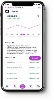
Stocks are categorized based on current market trends. Additionally, users can discover stocks that are personalized to them through a section that offers recommendations. They can also click on the company of interest to find out more about it to help make investment decisions.
The Reward Program
Through the board-game-like incentive milestone, we want to encourage users to stay with Alinea and create user loyalty so that they can keep their money while making more. Additionally, we made it easier for users to keep track of rewards claimed by adding a separate credit tab.
Reflections
What are the next steps?
These are a few things we would like to continue working on with Alinea:
Implement a social platform for Alinea:
We all know “word of mouth” is the most common way for people to get recommendations. Imagine if people in your circle or the people you follow could share their investing knowledge on a platform?
Enhance the tutorial:
Investing is a never-ending learning process. Our goal is to provide a learning space where users can gain more knowledge that will help them to make the most of their investment
More user testing:
The app could be refined to benefit the target users by conducting more usability testing, as we all know there are no perfect designs.
What did I learn?
This was my first client project, it was fun and challenging at the same time. As I learned, there is no smooth project. You will encounter roadblocks along the way. Being able to find a solution and resolve the issues you encounter is how designers improve the user experience. Designers must be comfortable with the uncertainty and the unknown and always remember the importance of success metrics in validating their design decisions.


